
Design tokens
Updated token infrastructure deployed across internal and external design systems at Target.
Overview
Target has two design systems. Nicollet serves the public (guest) facing products like target.com and the Target app and Canvas which powers hundreds of internal applications used by thousands of employees and partners every day.
Neither Nicollet or Canvas had a token system that was easy for designers or developers to use or maintain. This led to confusion, misuse of tokens and slow updates.
This project aimed at bringing a coheisive strategy and convention to how we name, organize and deploy design languages through design tokens across Nicollet and Canvas.
Architecture
The first thing we needed to solve for was the fundemental architecture. We needed to consider both light and dark modes in Nicollet as well as light and dark modes for each theme available in Canvas. This lead us a basic architecture that has three types of tokens, primitive, functional & component. Each one serves a unique purpose and has a clear role to play.

Token architecture diagram showing token inheritance works
Naming convention
Creating a flexible, yet intuitive naming convetion was the next task. The new naming convention had to work across all tokens, themes and modes.
Primitive tokens
These are used to import desired values into the token system and are never used to style a piece of UI within an interface.
Colors are named in a basic way and appended with a 3 digit value, 100-900. 100 level colors have the lowest contrast to the base theme/mode color and 900 level colors have the highest contrast. This allows for consistent token structure across light and dark mode vs having them be inverted. This scales much better and makes for much more consistent token mapping within our functional tokens.
Functional tokens
Functional tokens are semantically named to help communicate how the token should be used within a UI. Their names should remain meaningful across all themes and color modes.
The naming convention follows a simple recipe.
First comes the element. This describes where we are going to be applying a token. Examples of this are text, border and background.
Next comes the attribute. This is the value that is being changed on the declared element. Some examples of this would be color and size.
Last is the descriptor. This brings clarity as to the purpose of the token.
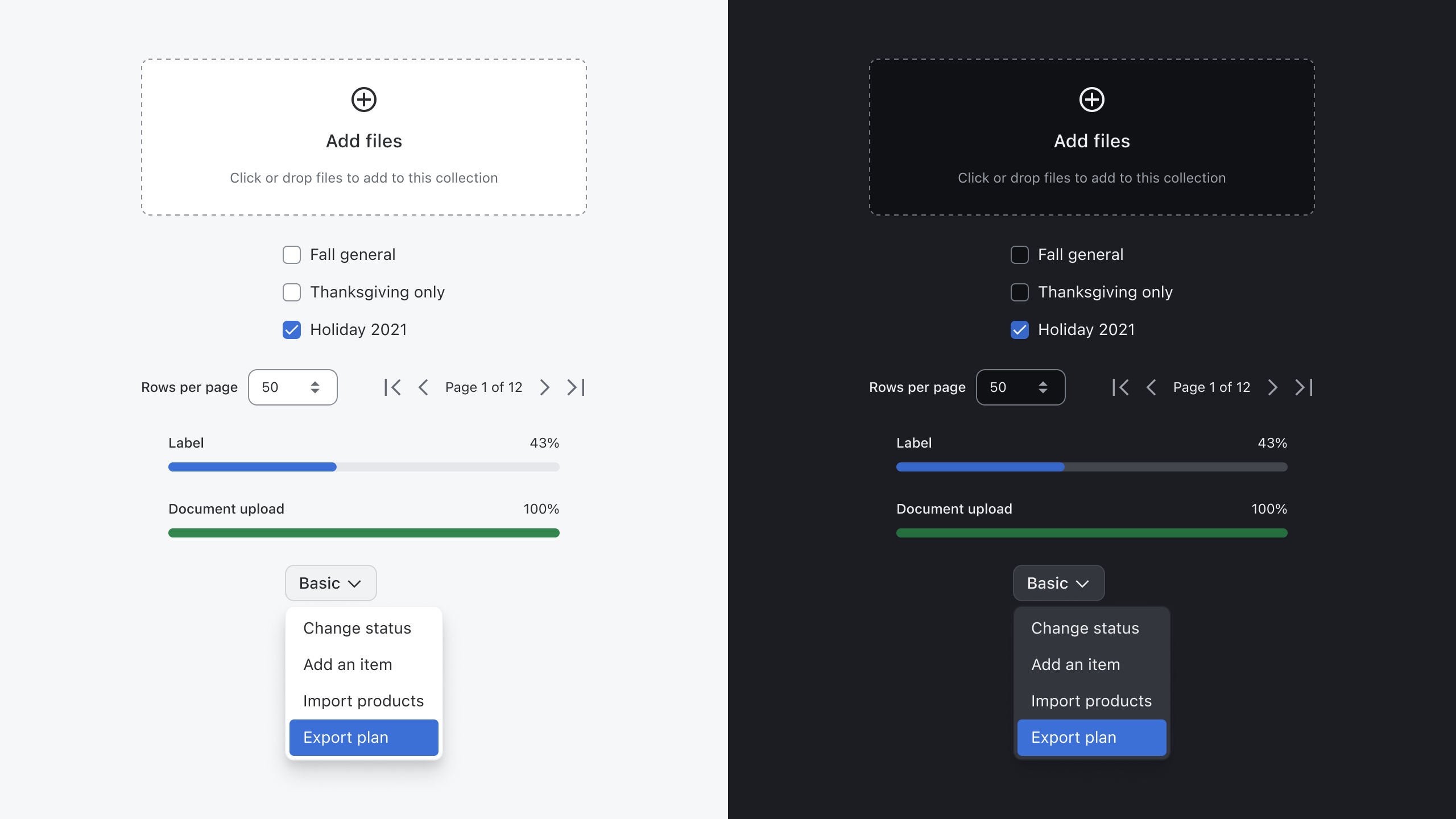
Component tokens
These are tokens that are scoped to a single component. Names are constructed by first declaring what component is being targeted and then they should follow the same element + attribute pattern used in functional tokens. Lastly, the descriptor should tell more about the specific component we are targeting. This may be a color variant or even a state that is unique to a single component.
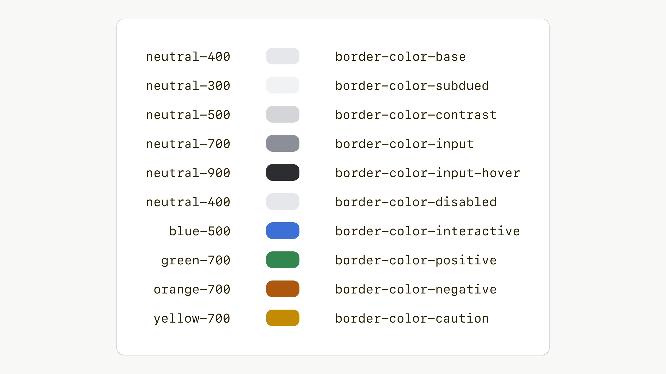
Functional border tokens
Token mapping
Before building the new system out, we needed to thouroughly test it. To do this we created token maps, like below, to see how different tokens would map across the system and to find where we needed to create component tokens.
We then used this map as a reference as we applied the new tokens to components.
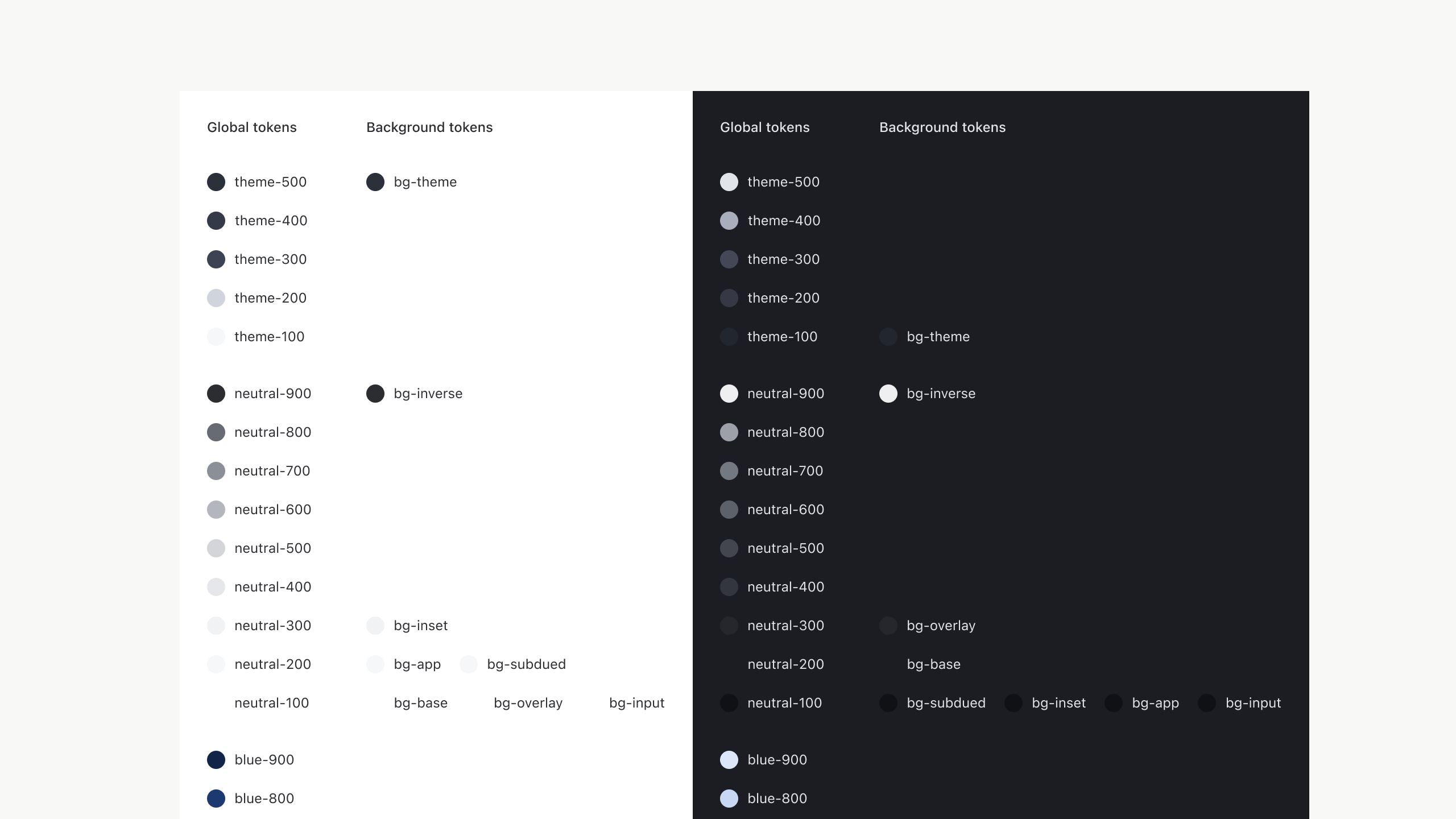
Mapping of background color tokens between light and dark mode
Rollout
We rolled this new architecture to Canvas and the Nicollet team was working on migrations when I left Target. We wrote design and developer guidance to help teams migrate their apps as this change was a major release.
Stats
Designers

1
Engineers

2
Time

3 months
Previoius
Next
Thanks for stopping by ✌️
Design tokens
Updated token infrastructure deployed across internal and external design systems at Target.
Overview
Target has two design systems. Nicollet serves the public (guest) facing products like target.com and the Target app and Canvas which powers hundreds of internal applications used by thousands of employees and partners every day.
Neither Nicollet or Canvas had a token system that was easy for designers or developers to use or maintain. This led to confusion, misuse of tokens and slow updates.
This project aimed at bringing a coheisive strategy and convention to how we name, organize and deploy design languages through design tokens across Nicollet and Canvas.
Architecture
The first thing we needed to solve for was the fundemental architecture. We needed to consider both light and dark modes in Nicollet as well as light and dark modes for each theme available in Canvas. This lead us a basic architecture that has three types of tokens, primitive, functional & component. Each one serves a unique purpose and has a clear role to play.
Token architecture diagram showing token inheritance works
Naming convention
Creating a flexible, yet intuitive naming convetion was the next task. The new naming convention had to work across all tokens, themes and modes.
Primitive tokens
These are used to import desired values into the token system and are never used to style a piece of UI within an interface.
Colors are named in a basic way and appended with a 3 digit value, 100-900. 100 level colors have the lowest contrast to the base theme/mode color and 900 level colors have the highest contrast. This allows for consistent token structure across light and dark mode vs having them be inverted. This scales much better and makes for much more consistent token mapping within our functional tokens.
Functional tokens
Functional tokens are semantically named to help communicate how the token should be used within a UI. Their names should remain meaningful across all themes and color modes.
The naming convention follows a simple recipe.
First comes the element. This describes where we are going to be applying a token. Examples of this are text, border and background.
Next comes the attribute. This is the value that is being changed on the declared element. Some examples of this would be color and size.
Last is the descriptor. This brings clarity as to the purpose of the token.
Component tokens
These are tokens that are scoped to a single component. Names are constructed by first declaring what component is being targeted and then they should follow the same element + attribute pattern used in functional tokens. Lastly, the descriptor should tell more about the specific component we are targeting. This may be a color variant or even a state that is unique to a single component.
Functional border tokens
Token mapping
Before building the new system out, we needed to thouroughly test it. To do this we created token maps, like below, to see how different tokens would map across the system and to find where we needed to create component tokens.
We then used this map as a reference as we applied the new tokens to components.
Mapping of background color tokens between light and dark mode
Rollout
We rolled this new architecture to Canvas and the Nicollet team was working on migrations when I left Target. We wrote design and developer guidance to help teams migrate their apps as this change was a major release.
Stats
Designers

1
Engineers

3
Time

3 months
Previoius
Next
Thanks for stopping by ✌️
Design tokens
Updated token infrastructure deployed across internal and external design systems at Target.
Overview
Target has two design systems. Nicollet serves the public (guest) facing products like target.com and the Target app and Canvas which powers hundreds of internal applications used by thousands of employees and partners every day.
Neither Nicollet or Canvas had a token system that was easy for designers or developers to use or maintain. This led to confusion, misuse of tokens and slow updates.
This project aimed at bringing a coheisive strategy and convention to how we name, organize and deploy design languages through design tokens across Nicollet and Canvas.
Architecture
The first thing we needed to solve for was the fundemental architecture. We needed to consider both light and dark modes in Nicollet as well as light and dark modes for each theme available in Canvas. This lead us a basic architecture that has three types of tokens, primitive, functional & component. Each one serves a unique purpose and has a clear role to play.
Token architecture diagram showing token inheritance works
Naming convention
Creating a flexible, yet intuitive naming convetion was the next task. The new naming convention had to work across all tokens, themes and modes.
Primitive tokens
These are used to import desired values into the token system and are never used to style a piece of UI within an interface.
Colors are named in a basic way and appended with a 3 digit value, 100-900. 100 level colors have the lowest contrast to the base theme/mode color and 900 level colors have the highest contrast. This allows for consistent token structure across light and dark mode vs having them be inverted. This scales much better and makes for much more consistent token mapping within our functional tokens.
Functional tokens
Functional tokens are semantically named to help communicate how the token should be used within a UI. Their names should remain meaningful across all themes and color modes.
The naming convention follows a simple recipe.
First comes the element. This describes where we are going to be applying a token. Examples of this are text, border and background.
Next comes the attribute. This is the value that is being changed on the declared element. Some examples of this would be color and size.
Last is the descriptor. This brings clarity as to the purpose of the token.
Component tokens
These are tokens that are scoped to a single component. Names are constructed by first declaring what component is being targeted and then they should follow the same element + attribute pattern used in functional tokens. Lastly, the descriptor should tell more about the specific component we are targeting. This may be a color variant or even a state that is unique to a single component.
Functional border tokens
Token mapping
Before building the new system out, we needed to thouroughly test it. To do this we created token maps, like below, to see how different tokens would map across the system and to find where we needed to create component tokens.
We then used this map as a reference as we applied the new tokens to components.
Mapping of background color tokens between light and dark mode
Rollout
We rolled this new architecture to Canvas and the Nicollet team was working on migrations when I left Target. We wrote design and developer guidance to help teams migrate their apps as this change was a major release.
Stats
Designers
1
Engineers
2
Time
3 months
Previoius
Next
Thanks for stopping by ✌️