
Icon redesign
All new icon library for Targets enterprise design system.

Overview
Previously, Canvas (Target’s enterprise design system) utilized Font Awesome for all it’s icons. This project was aimed at replacing that dependency with a custom designed library that is made available to anyone building enterprise applications at Target.
We aimed to solve three primary things with this library:
- Fix alignment issues teams were having with Font Awesome assets.
- Create a library with a higher quality of visual design, one that fit better with the rest of our design language.
- Solve Target specific needs and use cases, bringing alignment across products in core areas like merchandising.
Design principles
Before starting any design the team aligned on some guiding princples so we were using more than subjective opinion as we went through reviews.
Clarity
Simple, clear and understandable icons
Legibility
Icons need to scale across all sizes and modes given the wide range of applications that use Canvas.
Harmony
Draw design cues from other peices of Canvas design language
Design language
The two main design cues we decided to pull from were the font family we were using, Helvetica For Target, as well as the shape of other core ui elements like buttons and cards. The icons should have the same sharpness and feel so the entire language feels coheasive.
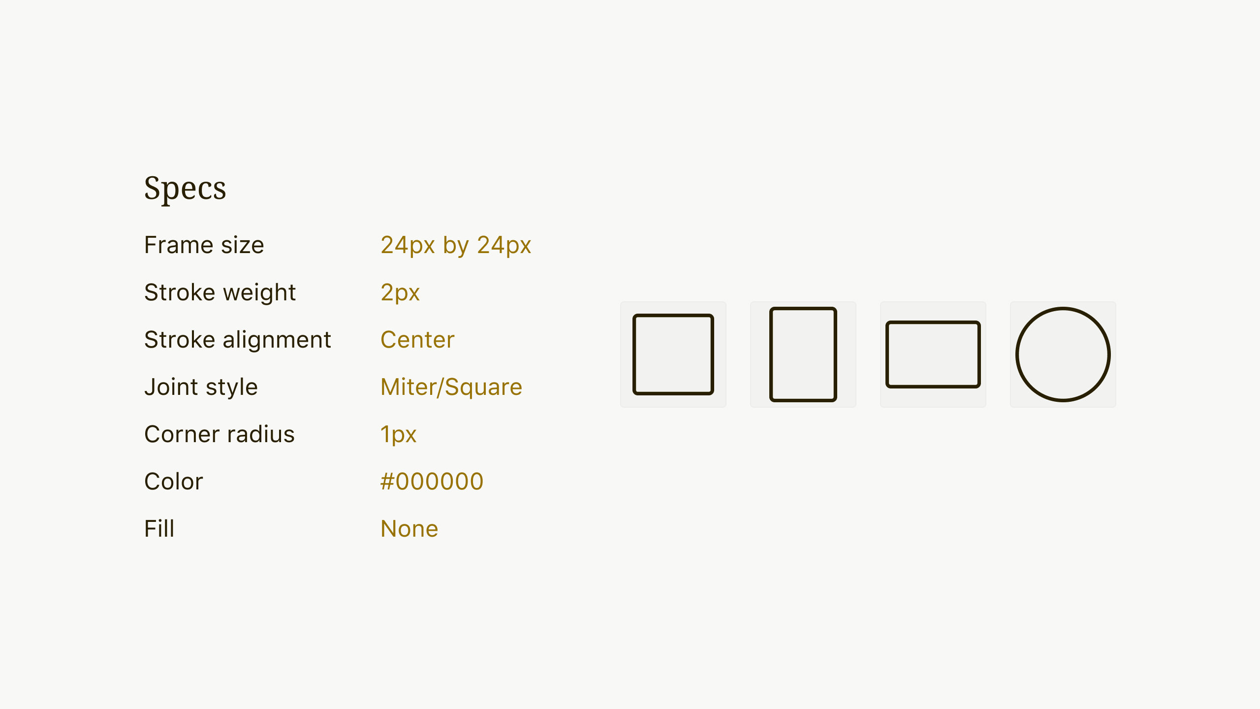
From this I created a set of 4 keylines to serve as the foundation for every icon I needed to design – a square, a circle, tall rectangle and wide rectangle.
Next was establishing the visual style of the library. This was done with loads of trial, error and testing. Together, the keylines and consistent visual language ensured each icon had proper visual weight, sizing and balance, creating harmony within the entire library.
Icon specs and design guides
Taxonomy
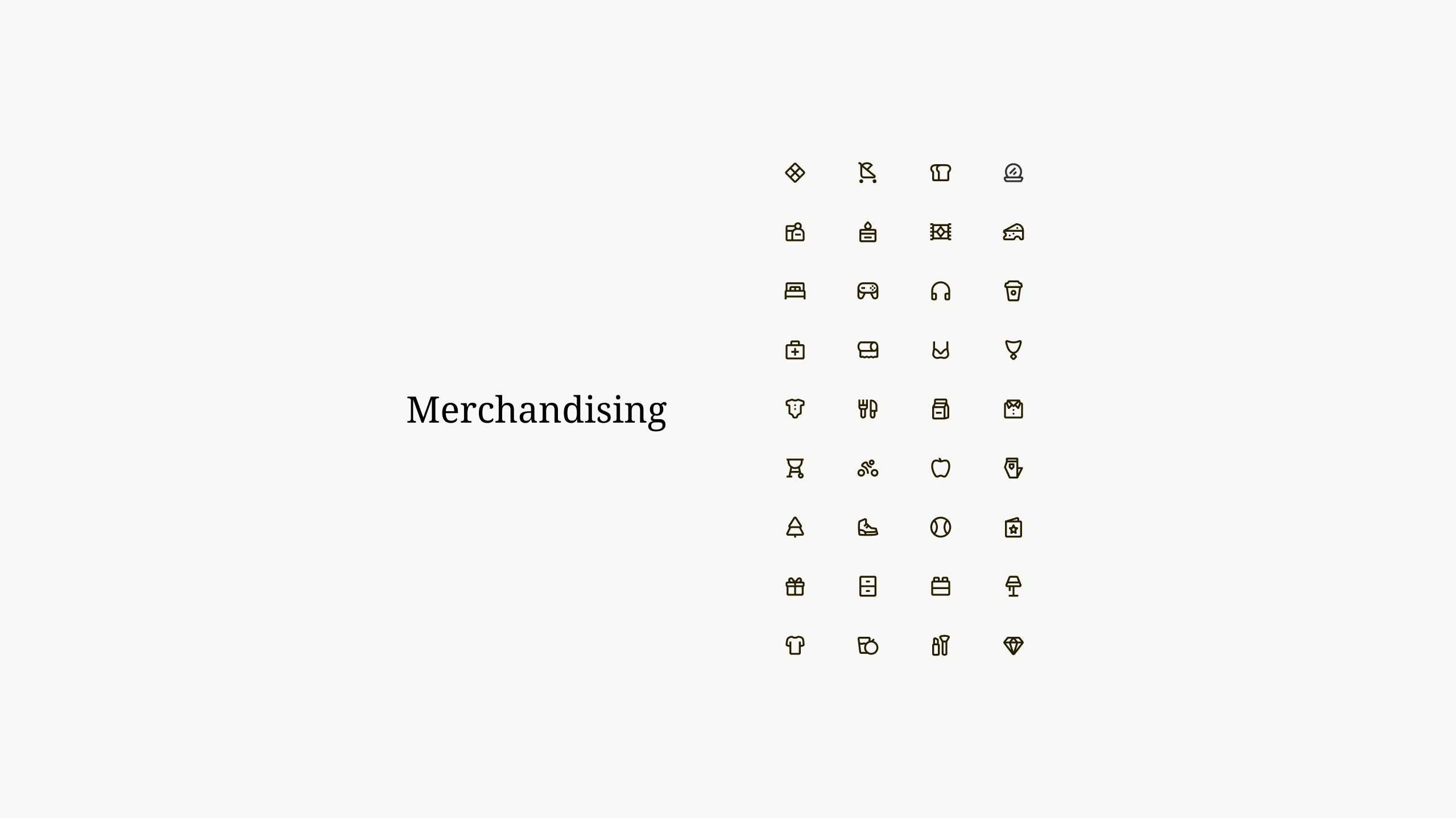
We placed all icons inside a category to help make icons more discoverable and help designers and developers use the right icons for certain situations. In the end we ended up with distinct categories.
Example of the Tree view

System icons
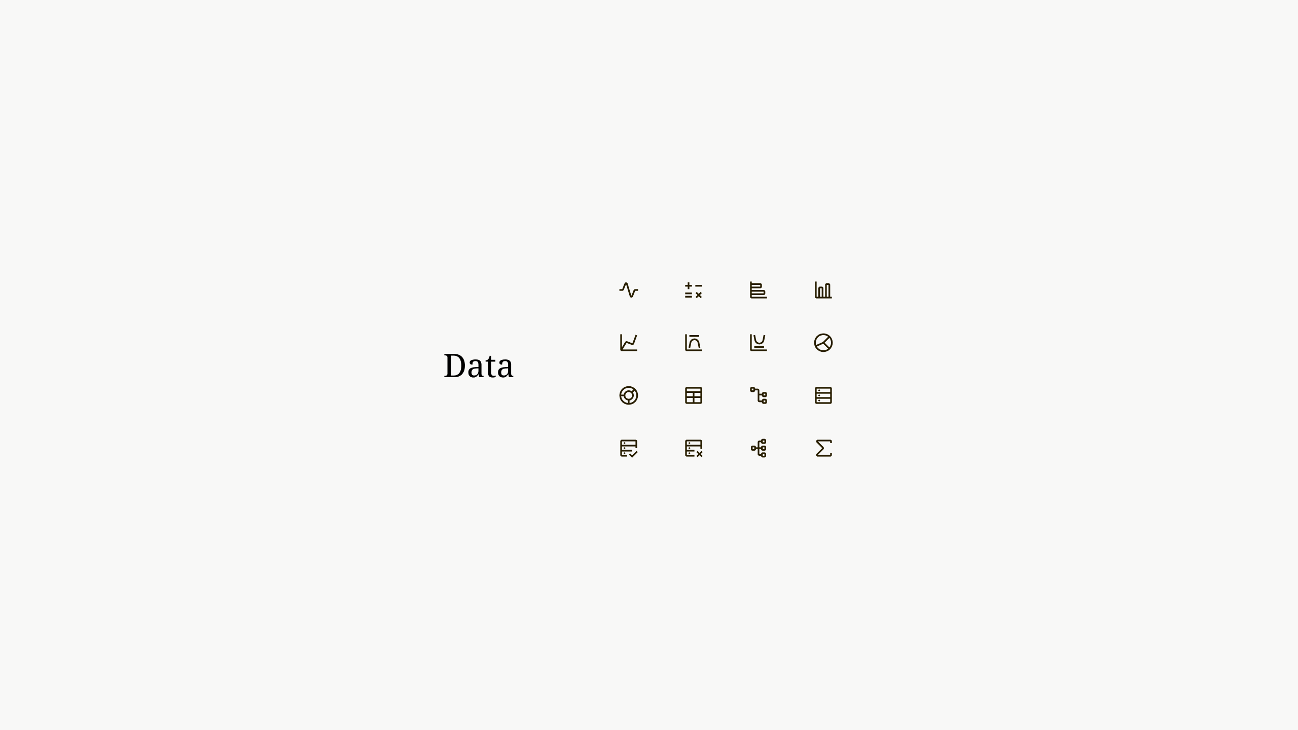
Data visualization icons
Documentation
Thorough documentation was also written and added to the interanl Canvas website so designers and engineers can easily look through the library, find icons and get code snippets for using icons within their products.
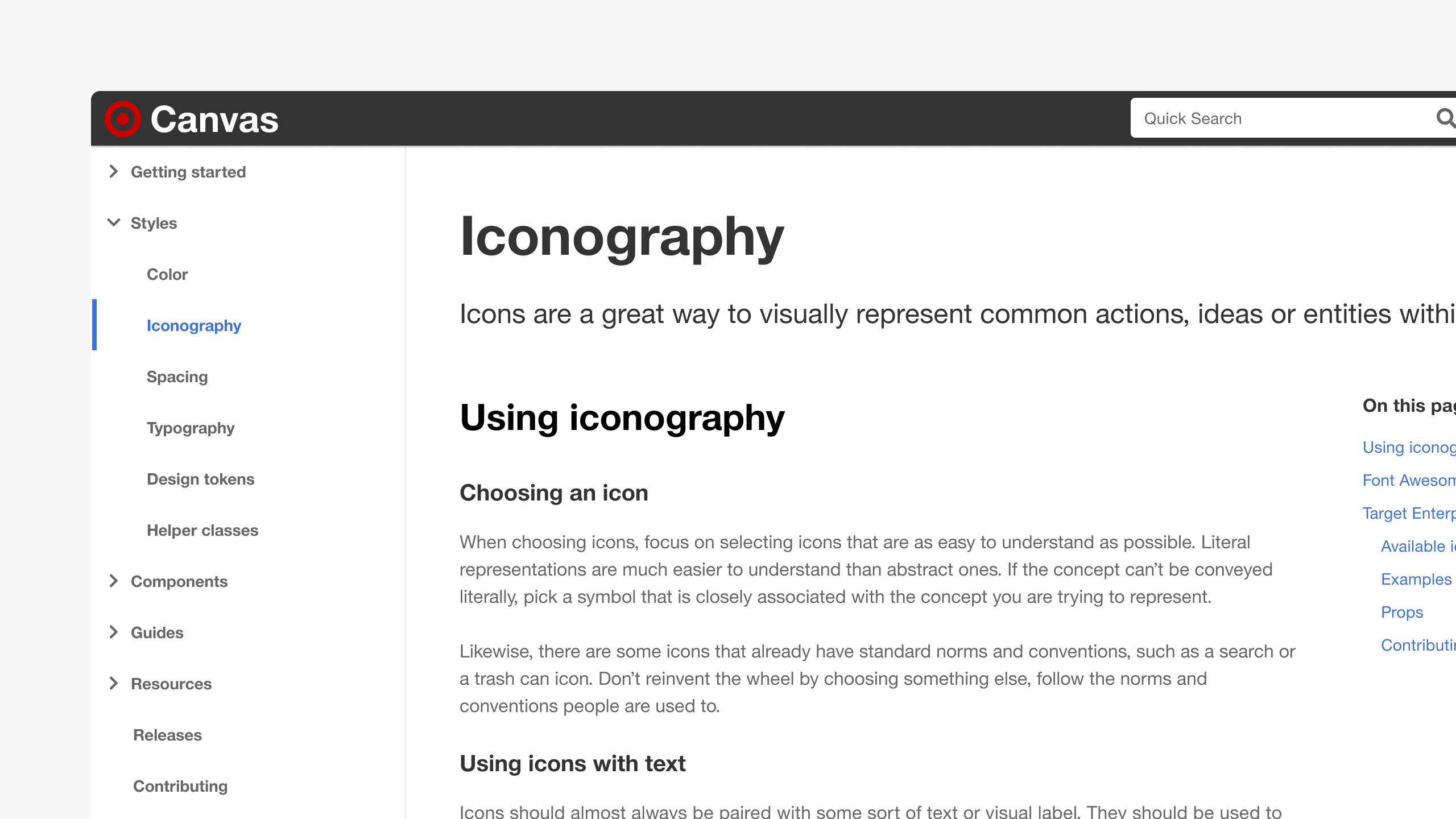
Icon documentation on internal Canvas website
Rollout
We rolled out the new icons via a simple React component in Canvas. Full design and developer tooling and documention was shipped in tandum along with contribution guides.
Stats
Designers

1
Engineers

2
Time

2 months
Naz Reid.
Icon redesign
All new icon library for Targets enterprise design system.
Overview
Previously, Canvas (Target’s enterprise design system) utilized Font Awesome for all it’s icons. This project was aimed at replacing that dependency with a custom designed library that is made available to anyone building enterprise applications at Target.
We aimed to solve three primary things with this library:
- Fix alignment issues teams were having with Font Awesome assets.
- Create a library with a higher quality of visual design, one that fit better with the rest of our design language.
- Solve Target specific needs and use cases, bringing alignment across products in core areas like merchandising.
Design principles
Before starting any design the team aligned on some guiding princples so we were using more than subjective opinion as we went through reviews.
Clarity
Simple, clear and understandable icons
Legibility
Icons need to scale across all sizes and modes given the wide range of applications that use Canvas.
Harmony
Draw design cues from other peices of Canvas design language
Design language
The two main design cues we decided to pull from were the font family we were using, Helvetica For Target, as well as the shape of other core ui elements like buttons and cards. The icons should have the same sharpness and feel so the entire language feels coheasive.
From this I created a set of 4 keylines to serve as the foundation for every icon I needed to design – a square, a circle, tall rectangle and wide rectangle.
Next was establishing the visual style of the library. This was done with loads of trial, error and testing. Together, the keylines and consistent visual language ensured each icon had proper visual weight, sizing and balance, creating harmony within the entire library.
Icon specs and design guides
Taxonomy
We placed all icons inside a category to help make icons more discoverable and help designers and developers use the right icons for certain situations. In the end we ended up with distinct categories.
Example of the Tree view
System icons
Data visualization icons
Documentation
Thorough documentation was also written and added to the interanl Canvas website so designers and engineers can easily look through the library, find icons and get code snippets for using icons within their products.
Icon documentation on internal Canvas website
Rollout
We rolled out the new icons via a simple React component in Canvas. Full design and developer tooling and documention was shipped in tandum along with contribution guides.
Stats
Designers
1
Engineers
2
Time
2 months
Naz Reid.