
Webveiws
Strategy, component and screen design of core webviews inside the Shopify app.
Overview
Shopify decided to make a core technology change in their mobile app. Instead of writing native code, they would migrate to React Native for core screens and then heavily leverage webviews for the rest of the app.
This meant that Polaris would drive more merchant experiences than ever before and therefore we needed to enhance the mobile design of our core styles, icons and components.
Design strategy
The core focus of the project was to make the webview experience the best we could. We didn’t want merhcants to feel like they were using two different apps as they navigated between pages written with React Native and those leveraging webviews. We needed to make the Shopify app feel unified and coheasive no matter what technology was driving the experience the merchant was currently using.
Typography
The first problem to solve was the fact that the mobile apps and the web didn’t use the type styles. There were some fairly large differences between core title styles as well as smaller body styles often used for supporting copy.
We audited both type systems and made adjustments to our design tokens in order to scale the new type scale. We also took the opportunity to fully migrate the native apps to direcly using Polaris tokens so one repository of tokens was powering both experiences.
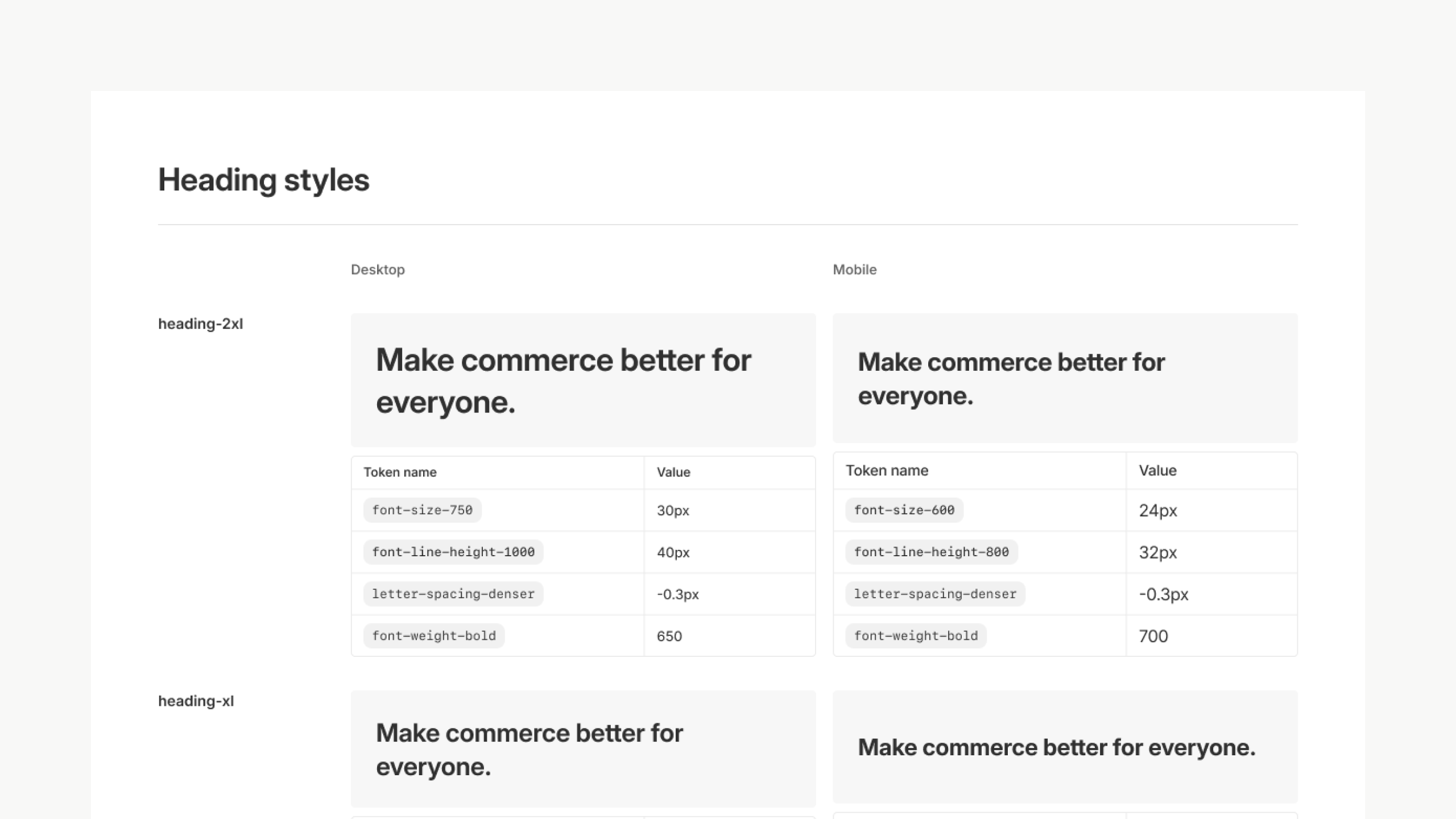
Typography style sheet mapping out desktop and mobile type
Icons
Just like typography, until this project, the web and native experiences of the Admin were using different icon libraries. The native codebase was using an old, forked version of Polaris. We had totally redesigned our icon library since then (a project I led). This meant that as merchants went from one screen to the next the style of iconogrpahy would change, making it very obvious that what was a webview and what wasn’t.
The current Polaris icons came in a single size. That was perfect for desktop but didn’t scale well on mobile. The tight, complentary design and sizing between icons and typography broke in places with the typography changes we made.
We didn’t want to redraw the entire set of more than 500 icons as that would be far to costly now and for future contributions.
That led us to a unique solution where we kept the initial viewbox of 20px by 20px, ensuring no layouts would break, but slightly scaled up the actual svg inside the viewbox. This allows us to still only maintain a single svg but functionally have mutliple sizes.
Like type, this was the first time both the web and the Shopify apps were using the exact same icon library.
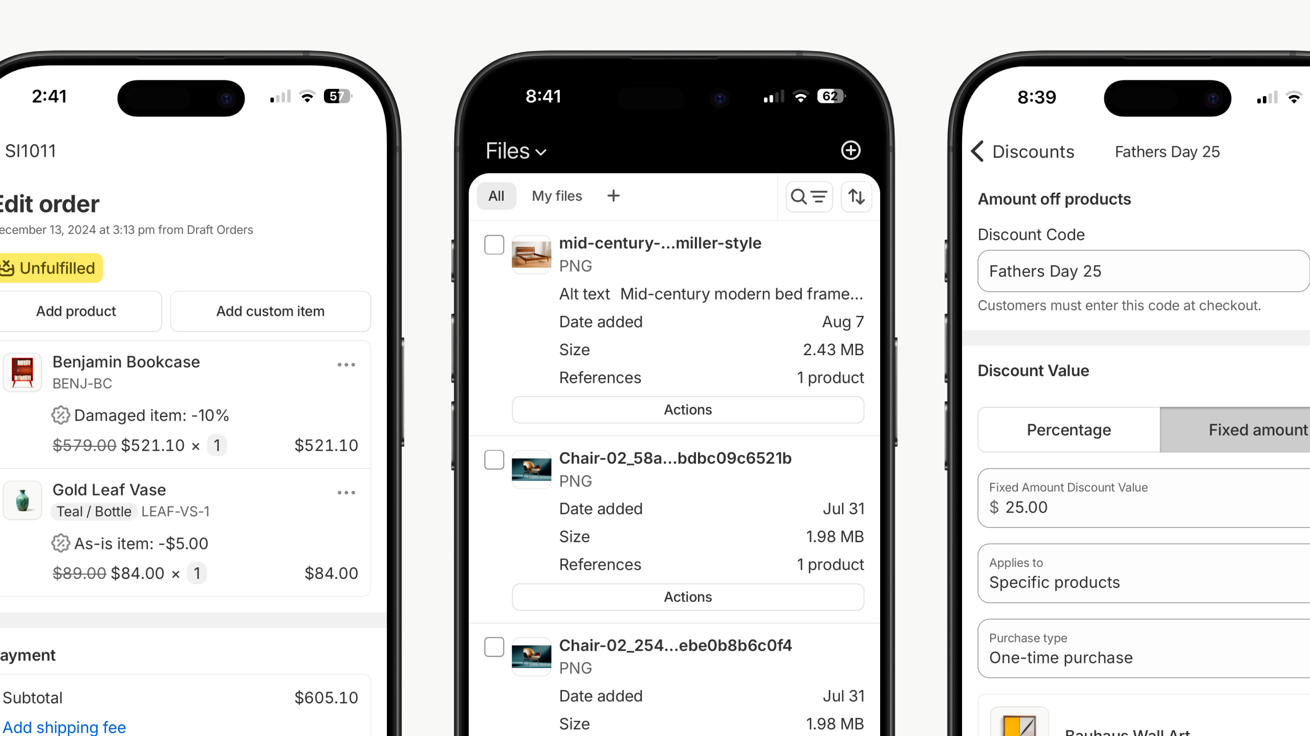
Various screens featuring updated icons insdie the Shopify app
Components
After our type and icon differences were fixed, we turned to components themselves. Once again we looked at Polaris componetns and the React Native components alike to find where and how we needed to align them. We focused our time on the most impactful components like buttons, form inputs, banners and cards making them look and feel at home in a native app.
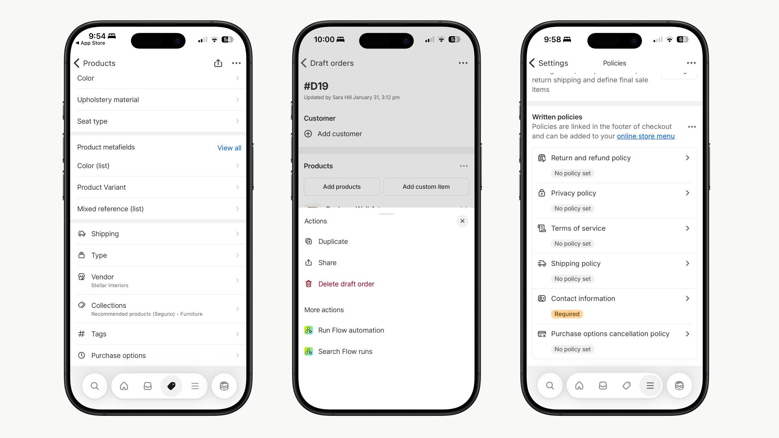
Webviews with redesigned Polaris components
Screens
Lastly, we identified a handful of the most used webview screens and went to work updating their design. While every screen got the updated typography, icons and components for free, fixing these key screens would allow us to showcase and document other patterns we wanted teams to use. They served as cornerstone examples of how we wanted to think and design for webviews.
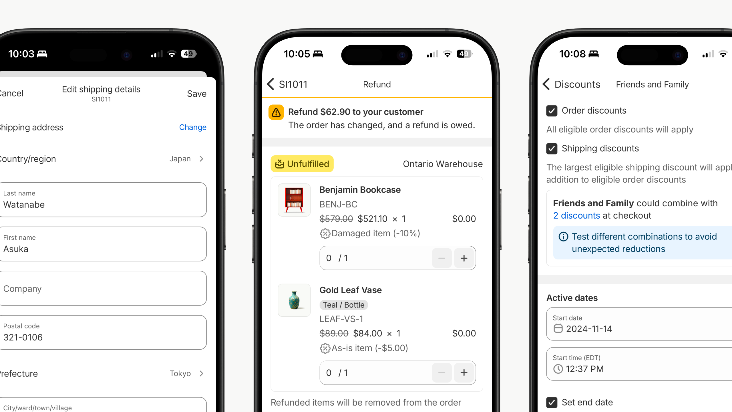
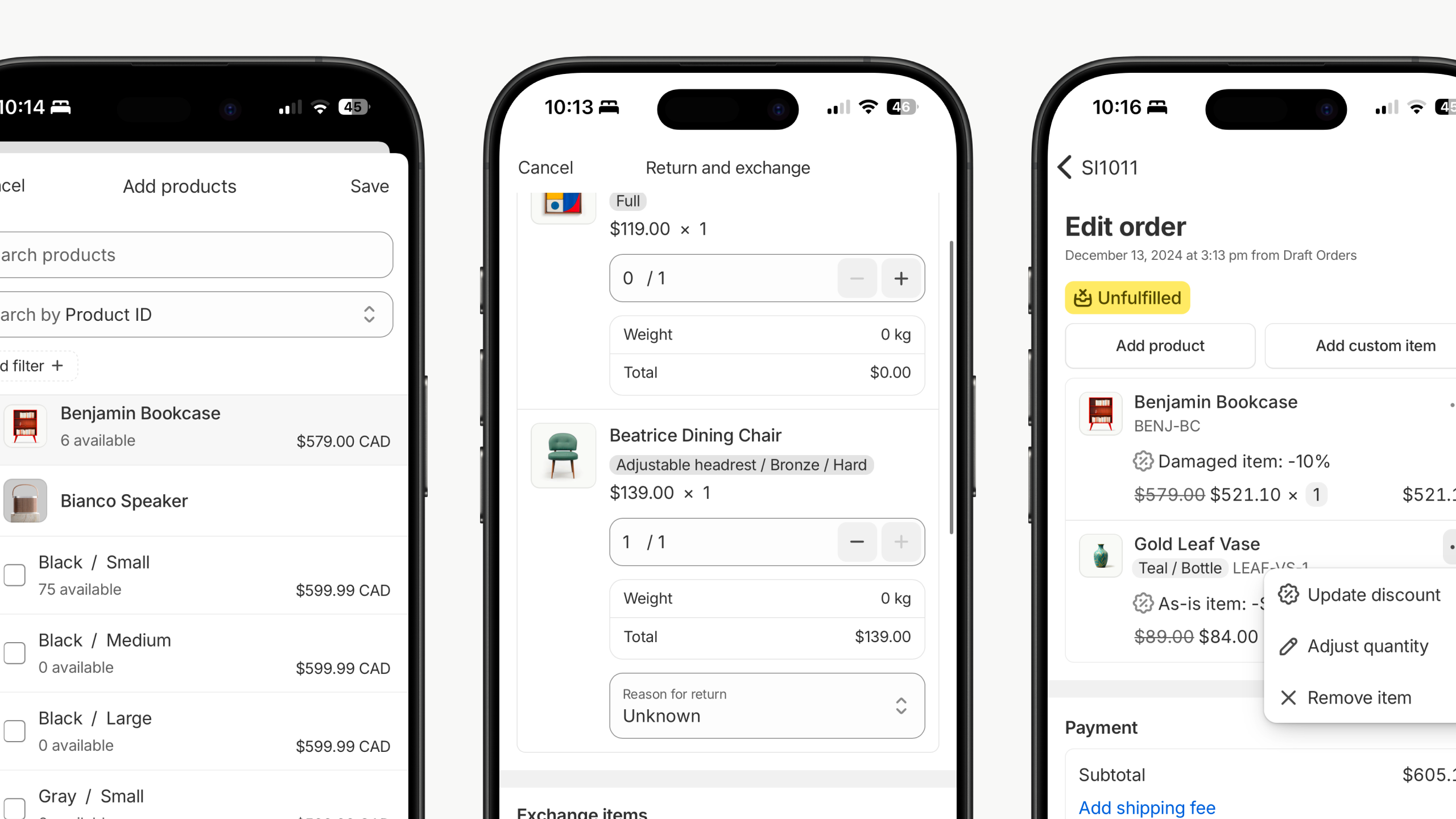
Examples of core webviews that were redesigned
Rollout
We rolled out this project in phases that followed the above breakdown. Fixing tokens, icons, components and then screens. With each step we documented changes, updated UI Kits in Figma and wrote guidance for developers.
Stats
Designers

1
Engineers

12
Time

4 months
Total PRs

131
Thanks for stopping by ✌️
Webveiws
Strategy, component and screen design of core webviews inside the Shopify app.
Overview
Shopify decided to make a core technology change in their mobile app. Instead of writing native code, they would migrate to React Native for core screens and then heavily leverage webviews for the rest of the app.
This meant that Polaris would drive more merchant experiences than ever before and therefore we needed to enhance the mobile design of our core styles, icons and components.
Design strategy
The core focus of the project was to make the webview experience the best we could. We didn’t want merhcants to feel like they were using two different apps as they navigated between pages written with React Native and those leveraging webviews. We needed to make the Shopify app feel unified and coheasive no matter what technology was driving the experience the merchant was currently using.
Typography
The first problem to solve was the fact that the mobile apps and the web didn’t use the type styles. There were some fairly large differences between core title styles as well as smaller body styles often used for supporting copy.
We audited both type systems and made adjustments to our design tokens in order to scale the new type scale. We also took the opportunity to fully migrate the native apps to direcly using Polaris tokens so one repository of tokens was powering both experiences.
Typography style sheet mapping out desktop and mobile type
Icons
Just like typography, until this project, the web and native experiences of the Admin were using different icon libraries. The native codebase was using an old, forked version of Polaris. We had totally redesigned our icon library since then (a project I led). This meant that as merchants went from one screen to the next the style of iconogrpahy would change, making it very obvious that what was a webview and what wasn’t.
The current Polaris icons came in a single size. That was perfect for desktop but didn’t scale well on mobile. The tight, complentary design and sizing between icons and typography broke in places with the typography changes we made.
We didn’t want to redraw the entire set of more than 500 icons as that would be far to costly now and for future contributions.
That led us to a unique solution where we kept the initial viewbox of 20px by 20px, ensuring no layouts would break, but slightly scaled up the actual svg inside the viewbox. This allows us to still only maintain a single svg but functionally have mutliple sizes.
Like type, this was the first time both the web and the Shopify apps were using the exact same icon library.
Various screens featuring updated icons insdie the Shopify app
Components
After our type and icon differences were fixed, we turned to components themselves. Once again we looked at Polaris componetns and the React Native components alike to find where and how we needed to align them. We focused our time on the most impactful components like buttons, form inputs, banners and cards making them look and feel at home in a native app.
Webviews with redesigned Polaris components
Screens
Lastly, we identified a handful of the most used webview screens and went to work updating their design. While every screen got the updated typography, icons and components for free, fixing these key screens would allow us to showcase and document other patterns we wanted teams to use. They served as cornerstone examples of how we wanted to think and design for webviews.
Examples of core webviews that were redesigned
Rollout
We rolled out this project in phases that followed the above breakdown. Fixing tokens, icons, components and then screens. With each step we documented changes, updated UI Kits in Figma and wrote guidance for developers.
Stats
Designers
1
Engineers

12
Time

4 months
Total PRs

131
Thanks for stopping by ✌️
Webveiws
Strategy, component and screen design of core webviews inside the Shopify app
Overview
Shopify decided to make a core technology change in their mobile app. Instead of writing native code, they would migrate to React Native for core screens and then heavily leverage webviews for the rest of the app.
This meant that Polaris would drive more merchant experiences than ever before and therefore we needed to enhance the mobile design of our core styles, icons and components.
Design strategy
The core focus of the project was to make the webview experience the best we could. We didn’t want merhcants to feel like they were using two different apps as they navigated between pages written with React Native and those leveraging webviews. We needed to make the Shopify app feel unified and coheasive no matter what technology was driving the experience the merchant was currently using.
Typography
The first problem to solve was the fact that the mobile apps and the web didn’t use the type styles. There were some fairly large differences between core title styles as well as smaller body styles often used for supporting copy.
We audited both type systems and made adjustments to our design tokens in order to scale the new type scale. We also took the opportunity to fully migrate the native apps to direcly using Polaris tokens so one repository of tokens was powering both experiences.
Typography style sheet mapping out desktop and mobile type
Icons
Just like typography, until this project, the web and native experiences of the Admin were using different icon libraries. The native codebase was using an old, forked version of Polaris. We had totally redesigned our icon library since then (a project I led). This meant that as merchants went from one screen to the next the style of iconogrpahy would change, making it very obvious that what was a webview and what wasn’t.
The current Polaris icons came in a single size. That was perfect for desktop but didn’t scale well on mobile. The tight, complentary design and sizing between icons and typography broke in places with the typography changes we made.
We didn’t want to redraw the entire set of more than 500 icons as that would be far to costly now and for future contributions.
That led us to a unique solution where we kept the initial viewbox of 20px by 20px, ensuring no layouts would break, but slightly scaled up the actual svg inside the viewbox. This allows us to still only maintain a single svg but functionally have mutliple sizes.
Like type, this was the first time both the web and the Shopify apps were using the exact same icon library.
Various screens featuring updated icons insdie the Shopify app
Components
After our type and icon differences were fixed, we turned to components themselves. Once again we looked at Polaris componetns and the React Native components alike to find where and how we needed to align them. We focused our time on the most impactful components like buttons, form inputs, banners and cards making them look and feel at home in a native app.
Webviews with redesigned Polaris components
Screens
Lastly, we identified a handful of the most used webview screens and went to work updating their design. While every screen got the updated typography, icons and components for free, fixing these key screens would allow us to showcase and document other patterns we wanted teams to use. They served as cornerstone examples of how we wanted to think and design for webviews.
Examples of core webviews that were redesigned
Rollout
We rolled out this project in phases that followed the above breakdown. Fixing tokens, icons, components and then screens. With each step we documented changes, updated UI Kits in Figma and wrote guidance for developers.
Stats
Designers
1
Engineers
12
Time
4 months
Total PRs
131
Thanks for stopping by ✌️