
Table redesign
Redesign of the core table component that powers the most important and used screens in the Shopify admin.
Overview
The Table component is used all over the Shopify Admin, including the most common and important screens for all merchants. Shopify merchants spend the vast majority of their time within the Admin fulfilling orders and managing their product catalogs. Both of these foundational jobs are done inside the Polaris table component. The old version of this comopnent left a lot to be desired and therefore teams were constantly forking or overriding it in order to build the functionality they needed.
The aim of this project was to rebuild the table component from the ground up so it is more powerful, flexible, performent and has a first class mobile experience.
Presentation styles
The old table had a single, flat, traditional presentation style. This works for a lot of use cases and is still the core of the majority of tables within the Admin. However, we found some experiences where teams could use a different, more complex presentation style. For the initial launch we focused on one other style, the Tree.
The Tree presentational style shows a hierarchical structure by nesting rows under parents, creating a clear relationship. These parent/child groups can be infinently nested within eachother, giving teams all the future flexibility needed.
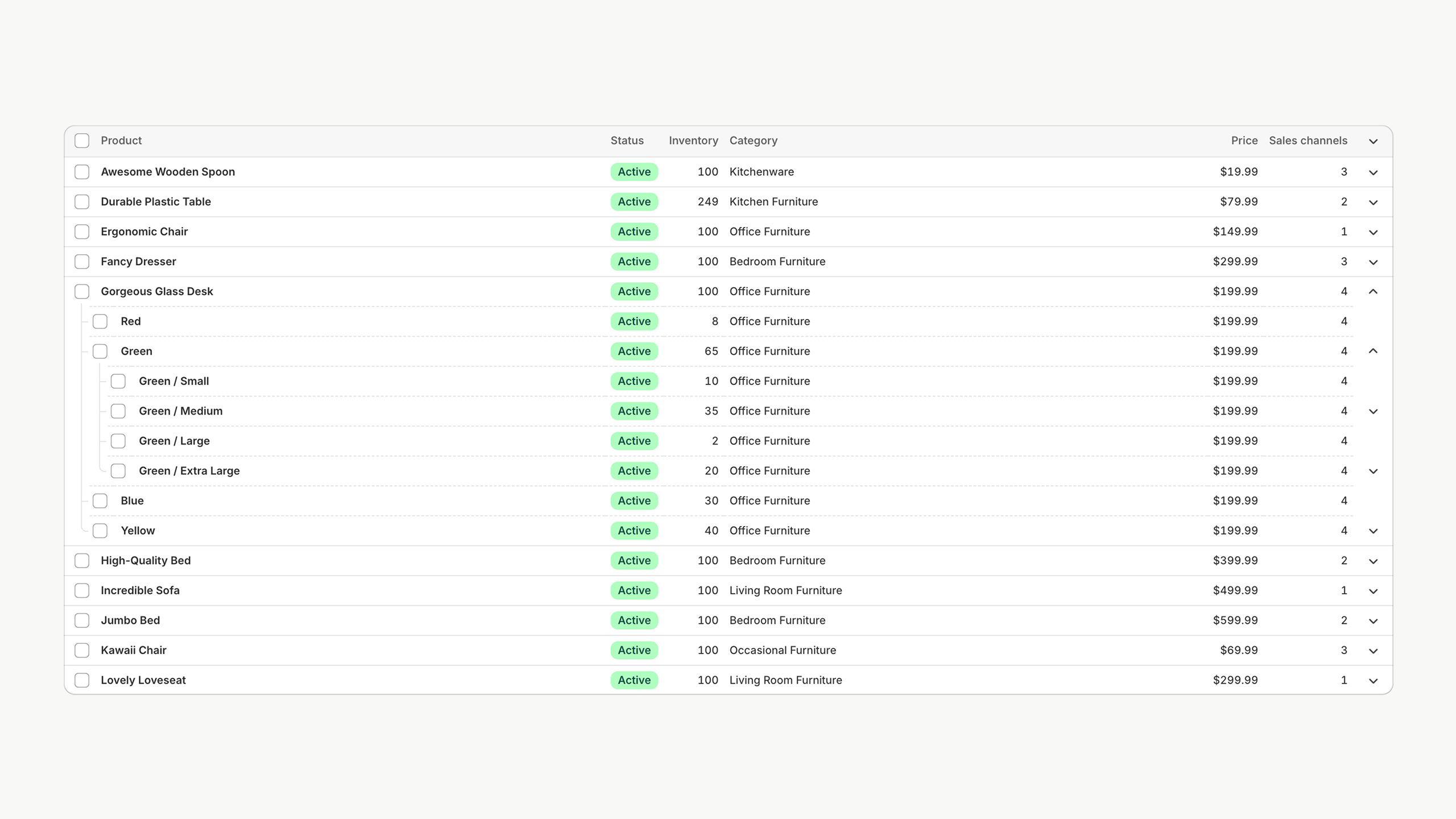
Tree view with multiple nested groups
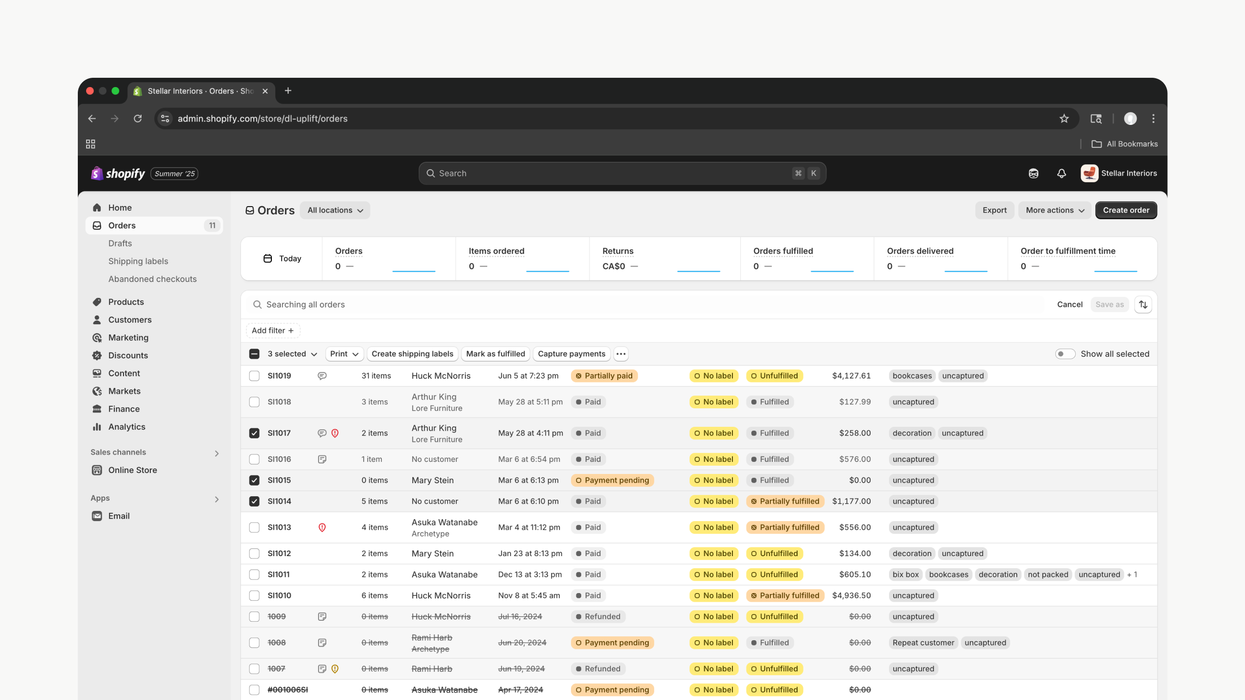
Bulk selection
Shopify powers some of the largest merchants in the world. These merchants need to be able to select in complex ways to perform an action across objects. In this new table we totally reimagined how selection works to give our merchants far more power and flexibility.
This includes the ability to not only select all on a given page, but select across pagination or even entire store. A common workflow that wasn’t baked into the table before is for merchants to search for a specific object, such as a product variant or order, select it and then search for another object. They might repeat this process until dozens of unique and disperate items are selected. The new table component now holds its selection state even as a merchant searches.
Bulk selection in the Product Index
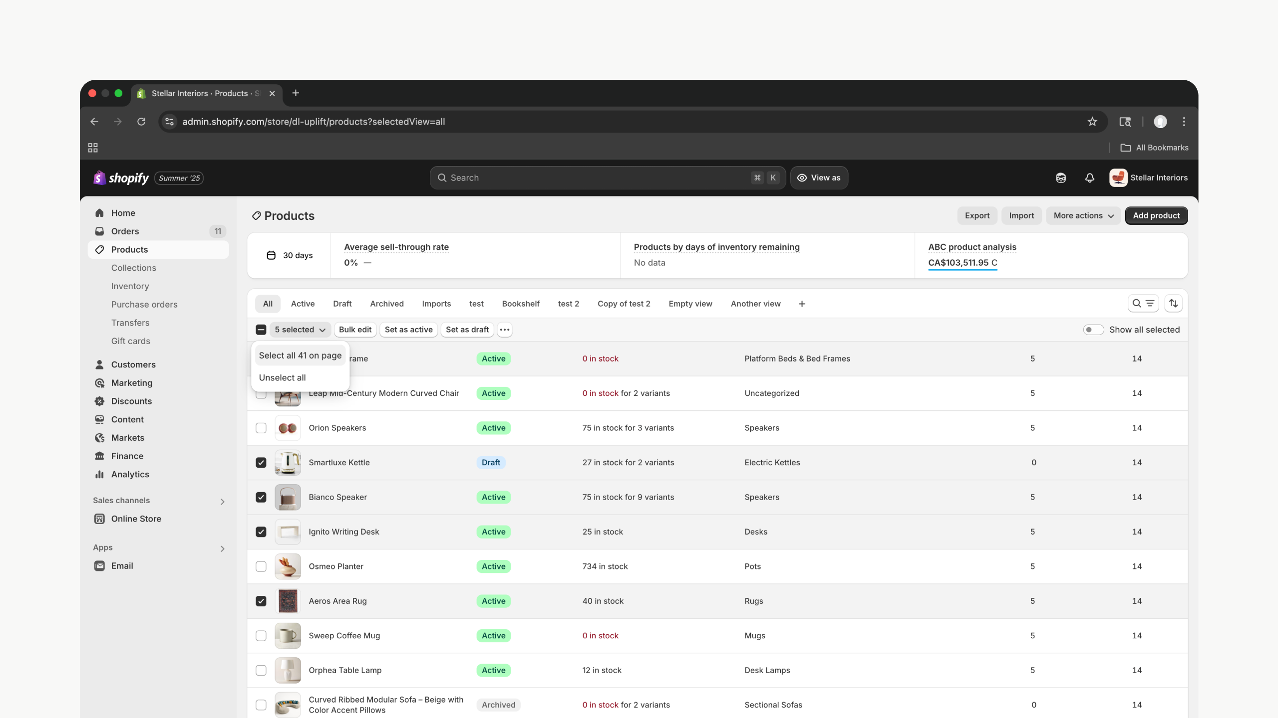
View all selected
The bulk selection flows outlined above often leads merchants to have selections spread across multiple pages of a given table. To accomodate this, we designed a “View all selected” toggle which brings all the selected rows from across the table into view. This allows merchants to see and review their selection all together before proceeding.
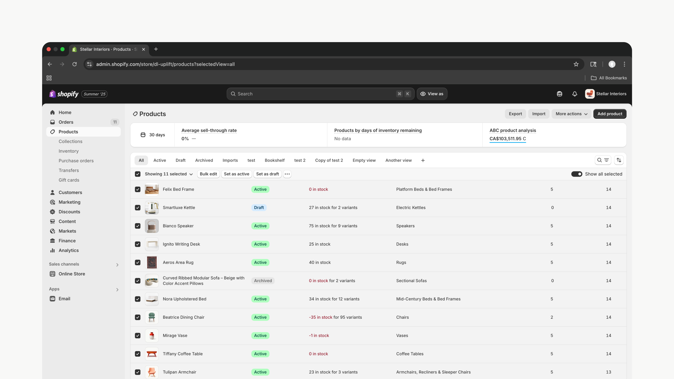
Product Index with “Show all selected” on
Row actions
A key piece of functionality we needed to add to the table was a way for merchants to quickly trigger actions on any given row of a table. This could be deleting, editing, viewing or anything else a team needs to build. Teams can now build these actions into any given row and we automatically render it in the same place. If more than 3 actions are availalable they get rolled into a menu.
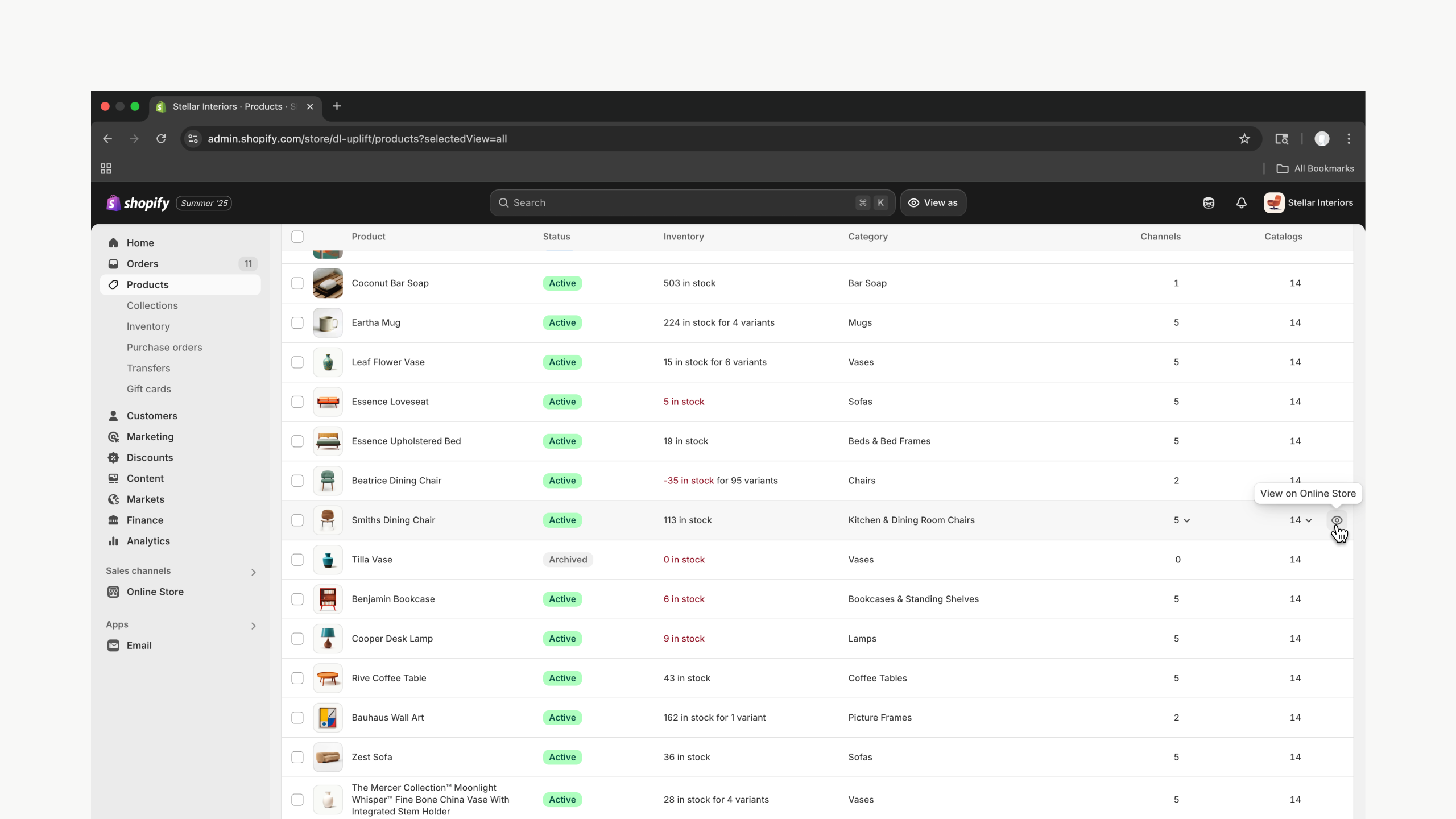
Row actions show as merchant hovers over table row
Mobile strategy
The original table component had no opinions about how it rendered on mobile. It was built when the majority of merchant traffic was coming from desktop computers. But as Shopify has grown more and more of our merchants are using their mobile device to run their store. Therefore, every team was building a custom mobile experience for tables in their section of the Admin. This left merchants with huge differences in layout and experience patterns.
Slots
To solve this problem, we took inventory dozens of instances of the table component and audited their data needs, layout and core functionality and started to map out the overlapping patterns and needs.
In the early design phase we aslo decided that we wanted all tables to render as lists on mobile so merchants didn’t have to scroll horizontally to see their data.
We developed a slot based system where developers could assign table columns to a slot. Those slots were then mapped into a predefined layout so merchants would have a consistent experience across their store.
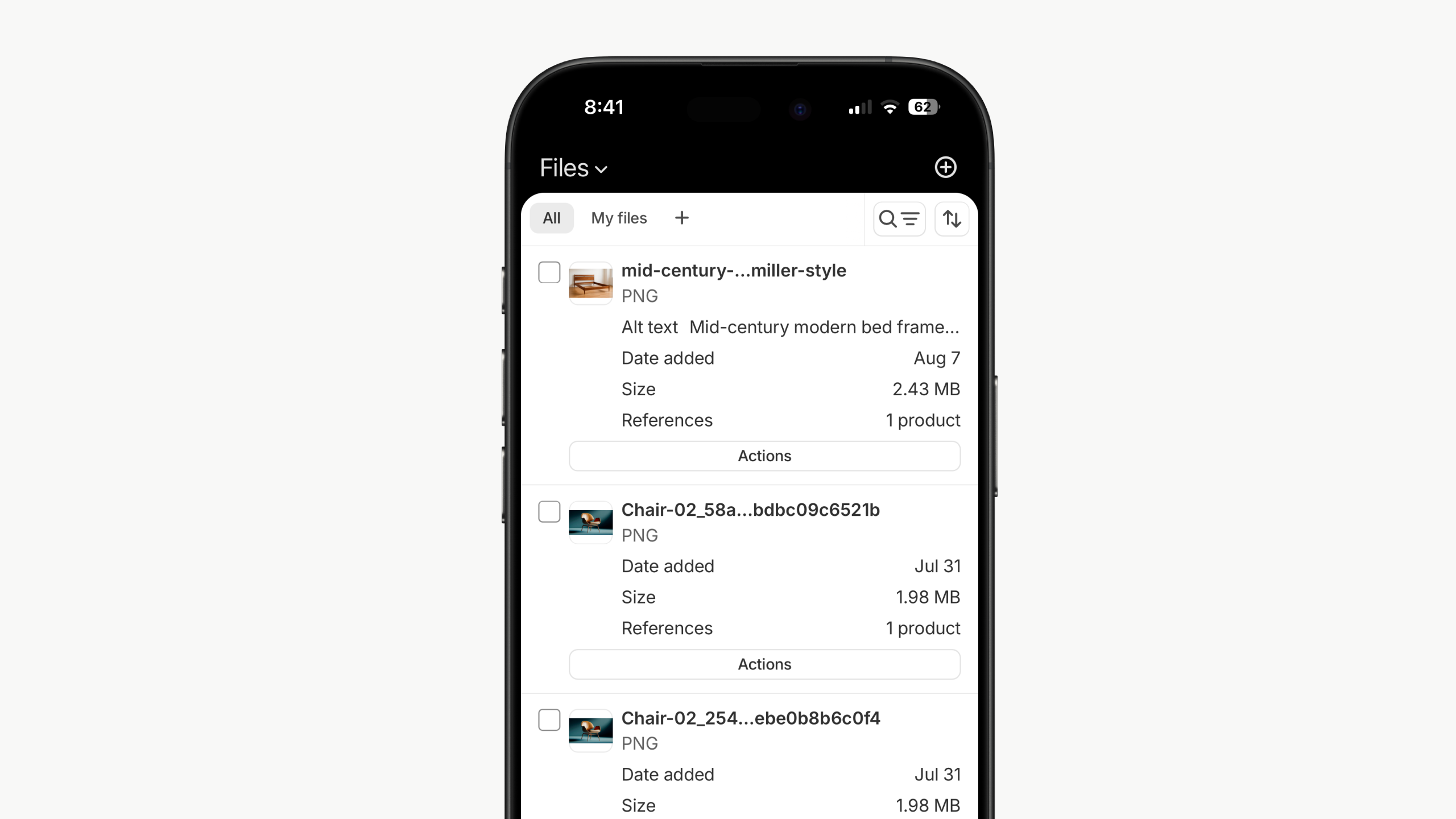
Files Index showing the mobile layout enabled by the slots that table columns can be mapped to
Bulk actions
When a merchant begins selecting rows from the table, any number of bulk actions are available to them. Because of the reduced space on mobile, this experience now comes up as a floating bar at the buttom of the screen, coming into view only when it is relevant.
Row actions
On desktop row actions appear on hover so they are only visible when a merchant shows some intent on a given row. On touch devices these actions are moved into a button at the bottom of a list item. When mulitple actions are available, they are rolled into an overflow menu.
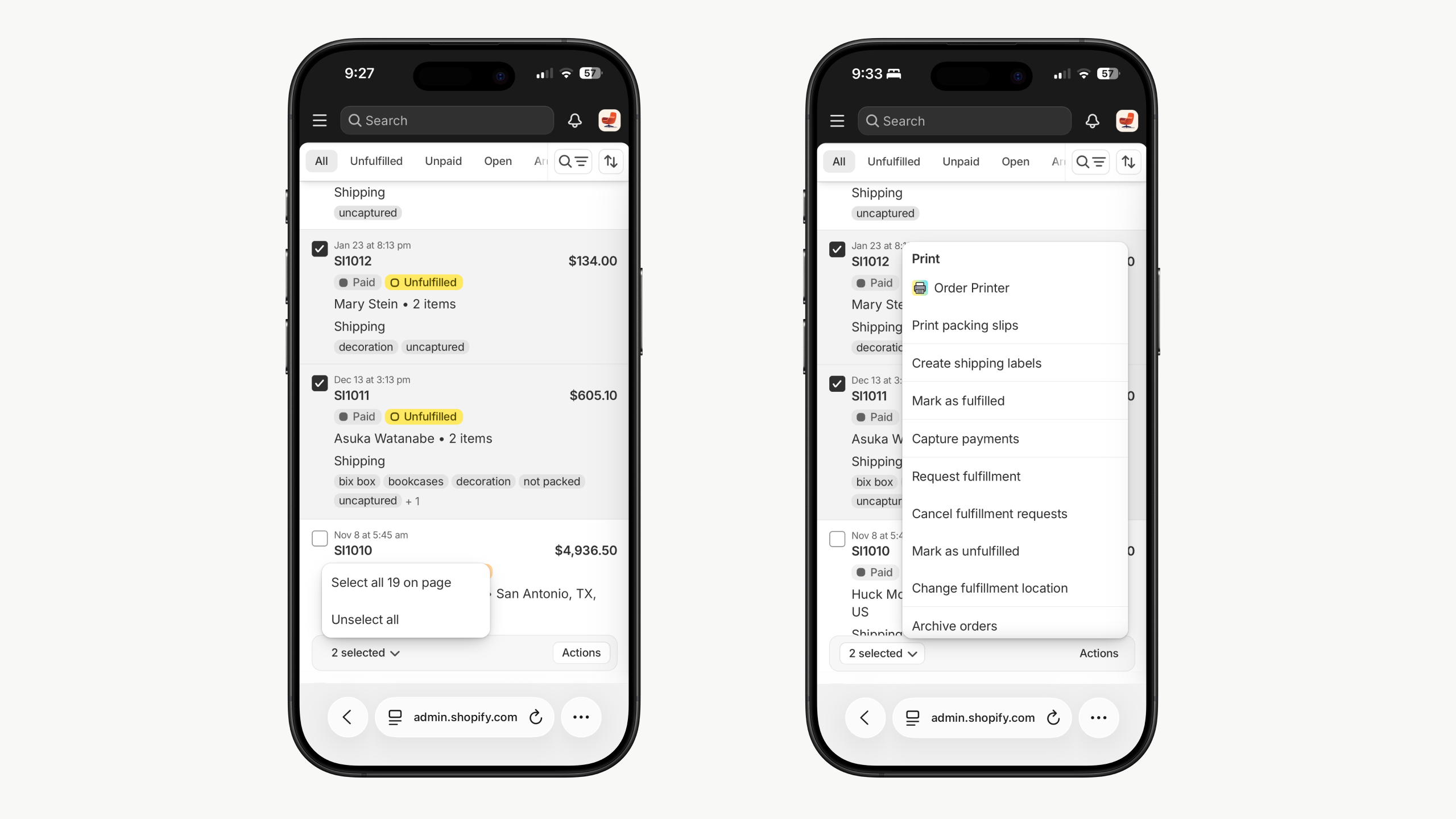
Order Index showing floating action bar with bulk selection and bulk actions
Rollout
The rollout of the new Table component was done in 3 phases.
- We built the new component as AlphaTable while the old Table remained in production.
- Once ready, we began migrating a select group of tables in the Admin such as Orders, Products and Files. This allowed us to thoroughly test in prodction before fully rolling out.
- After a successful rollout, we deprecated the old Table component and made the new component avaialbe for consomption by any product team building in the Admin.
Stats
Designers

2
Engineers

6
Time

5 months
Total PRs

66
Previoius
Next
Thanks for stopping by ✌️
Table redesign
Redesign of the core table component that powers the most important and used screens in the Shopify admin.
Overview
The Table component is used all over the Shopify Admin, including the most common and important screens for all merchants. Shopify merchants spend the vast majority of their time within the Admin fulfilling orders and managing their product catalogs. Both of these foundational jobs are done inside the Polaris table component. The old version of this comopnent left a lot to be desired and therefore teams were constantly forking or overriding it in order to build the functionality they needed.
The aim of this project was to rebuild the table component from the ground up so it is more powerful, flexible, performent and has a first class mobile experience.
Presentation styles
The old table had a single, flat, traditional presentation style. This works for a lot of use cases and is still the core of the majority of tables within the Admin. However, we found some experiences where teams could use a different, more complex presentation style. For the initial launch we focused on one other style, the Tree.
The Tree presentational style shows a hierarchical structure by nesting rows under parents, creating a clear relationship. These parent/child groups can be infinently nested within eachother, giving teams all the future flexibility needed.
Tree view with multiple nested groups
Bulk selection
Shopify powers some of the largest merchants in the world. These merchants need to be able to select in complex ways to perform an action across objects. In this new table we totally reimagined how selection works to give our merchants far more power and flexibility.
This includes the ability to not only select all on a given page, but select across pagination or even entire store. A common workflow that wasn’t baked into the table before is for merchants to search for a specific object, such as a product variant or order, select it and then search for another object. They might repeat this process until dozens of unique and disperate items are selected. The new table component now holds its selection state even as a merchant searches.
Bulk selection in the Product Index
View all selected
The bulk selection flows outlined above often leads merchants to have selections spread across multiple pages of a given table. To accomodate this, we designed a “View all selected” toggle which brings all the selected rows from across the table into view. This allows merchants to see and review their selection all together before proceeding.
Product Index with “Show all selected” on
Row actions
A key piece of functionality we needed to add to the table was a way for merchants to quickly trigger actions on any given row of a table. This could be deleting, editing, viewing or anything else a team needs to build. Teams can now build these actions into any given row and we automatically render it in the same place. If more than 3 actions are availalable they get rolled into a menu.
Row actions show as merchant hovers over table row
Mobile strategy
The original table component had no opinions about how it rendered on mobile. It was built when the majority of merchant traffic was coming from desktop computers. But as Shopify has grown more and more of our merchants are using their mobile device to run their store. Therefore, every team was building a custom mobile experience for tables in their section of the Admin. This left merchants with huge differences in layout and experience patterns.
Slots
To solve this problem, we took inventory dozens of instances of the table component and audited their data needs, layout and core functionality and started to map out the overlapping patterns and needs.
In the early design phase we aslo decided that we wanted all tables to render as lists on mobile so merchants didn’t have to scroll horizontally to see their data.
We developed a slot based system where developers could assign table columns to a slot. Those slots were then mapped into a predefined layout so merchants would have a consistent experience across their store.
Files Index showing the mobile layout enabled by the slots that table columns can be mapped to
Bulk actions
When a merchant begins selecting rows from the table, any number of bulk actions are available to them. Because of the reduced space on mobile, this experience now comes up as a floating bar at the buttom of the screen, coming into view only when it is relevant.
Row actions
On desktop row actions appear on hover so they are only visible when a merchant shows some intent on a given row. On touch devices these actions are moved into a button at the bottom of a list item. When mulitple actions are available, they are rolled into an overflow menu.
Order Index showing floating action bar with bulk selection and bulk actions
Rollout
The rollout of the new Table component was done in 3 phases.
- We built the new component as AlphaTable while the old Table remained in production.
- Once ready, we began migrating a select group of tables in the Admin such as Orders, Products and Files. This allowed us to thoroughly test in prodction before fully rolling out.
- After a successful rollout, we deprecated the old Table component and made the new component avaialbe for consomption by any product team building in the Admin.
Stats
Designers
2
Engineers
6
Time
5 months
Total PRs
66
Previoius
Next
Thanks for stopping by ✌️